Pentaptych. 2025.
This art work was done in connection with the Hoole Baptist Church Creative Lite group, regarding the theme of the Holy Spirit.
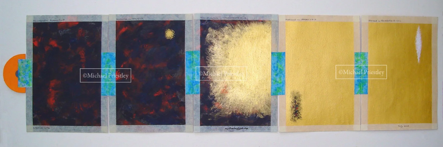
I initially thought of 1 picture, then 2, then 3 and finally 5 as the Holy Spirit led. The art work is autobiographical. The inside panels show me on panel 1 as unredeemed by the use of acrylic black, light black giving a grey, red and blue swirling around showing unsettledness, through to me in panel 5 redeemed in the eternal age. The Holy Spirit, represented by acrylic gold, is shown in panel 2 entering my life by my invitation, in panel 3 getting to grips with my waywardness and in panel 4 showing the results of that work in the previous panel but with me still having a sinful fallen nature depicted by an area of black, red and blue. In panel 5, the eternal age is also represented by gold with me now having no sinful fallen nature as depicted by the white area. There are Scripture references above each panel. Below each panel are references to the art work.
Masking tape is used for a frame for each panel, the frame is used to illustrate that my life is built upon a frame work for living. A lighter masking tape is used for the last 2 panels showing transformation in me has taken place. The masking tape for the frames has been left unpainted as I felt it was not necessary to paint them. I initially thought of joining the panels together with tags or metal rings but decided upon using masking tape as this could be painted to reveal something about me. The Masking tape is therefore painted in acrylic blue and green, a favourite colour combination of mine. Blue is also my favourite colour.
The outside panels are painted in an acrylic light flesh tint to reflect that I am light skinned and like the inside panels they are also framed. Panel 1 on the outside gives details of the work and panel 5 just gives the title of the work – ‘Pentaptych’. Like the inside panels the outside panels are also joined together by masking tape and are painted in another colour combination of blue and light flesh tint. The blue gives a link to the inside and the flesh tint to the outside.
The semi circular part is painted in another of my favourite colour combinations of blue and bright orange, the bright orange encouraging the viewer to pull open the art work. The use of a semi circular shape is derived from one of my favourite buildings, Joseph Paxton’s The Crystal Palace of 1851.